This guide will help you create a chart which shows the number of created vs resolved issues, in Excel.
Step-by-step guide
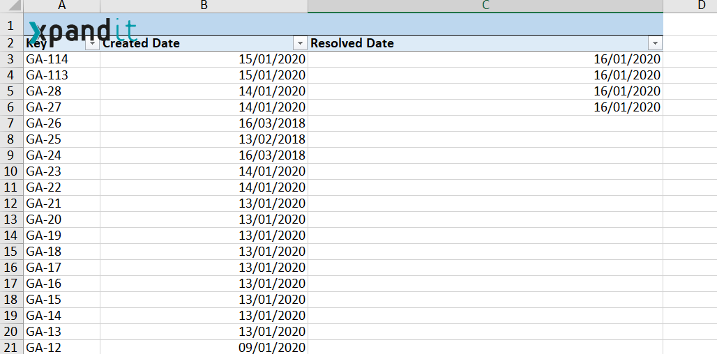
Create a template to export your issues with the fields "Created" and "Resolved".
- Open it in Excel, and select the data of these two columns.
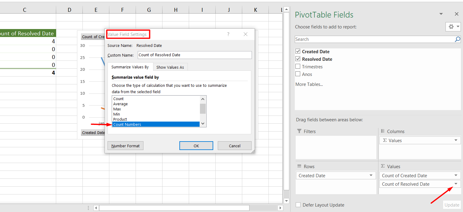
- Click on Insert >> Pivot Table >> Click OK
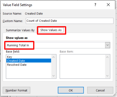
- Then add the Created Date to the Rows, and the Created Date and Resolution Date to the Values column. Then left-click on each item and go to Value Field Settings and choose the option Count Numbers, as shown below:
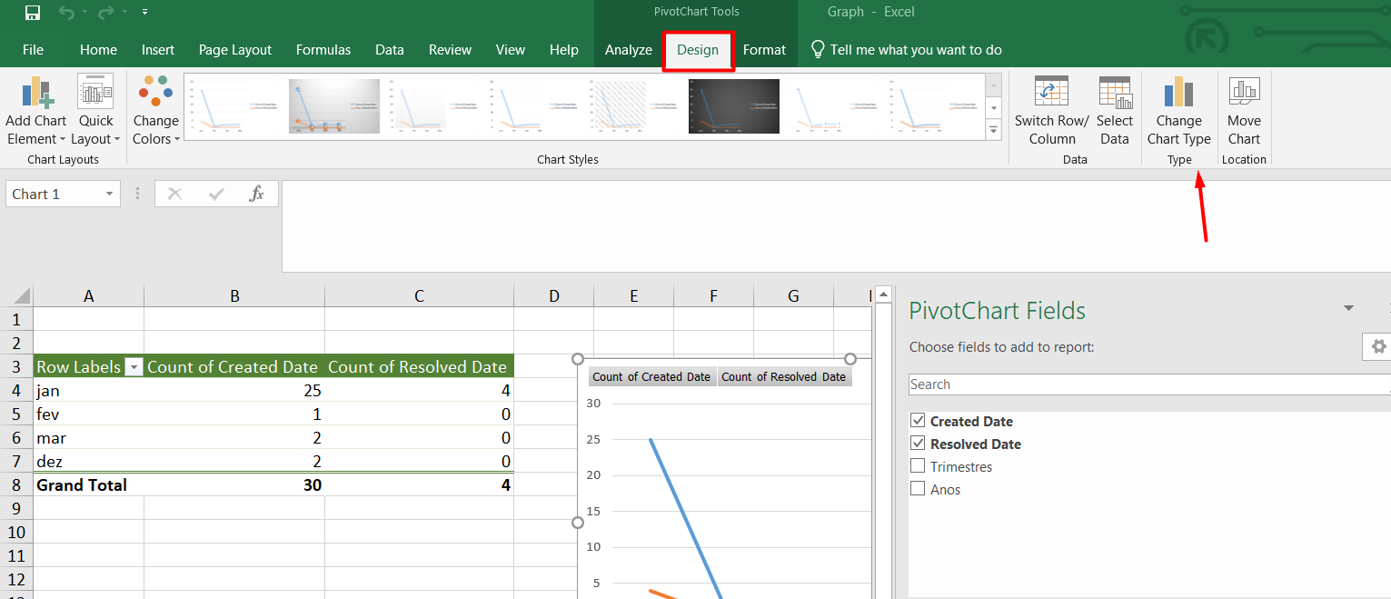
- Then you will obtain a graph. To change the graph type, just click on Design and Change Chart Type
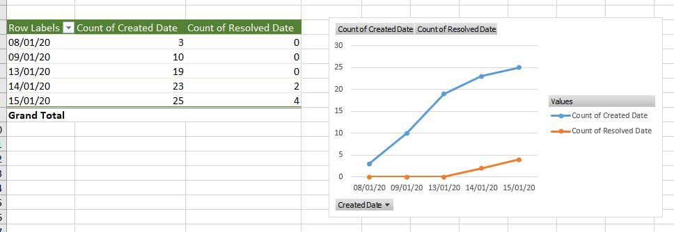
- And you can obtain this graph:
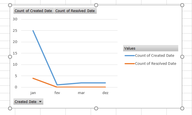
If you need a cumulative graph, please select this option in Values Field Settings:
This way, a graph like this is obtained: